1. Shoot performace of Joy in the Cafe - let us clearly see her singing - shots of her looking into the camera as well as away - film her singing the entire song - direct her in terms of looks/emotions in relation to particular lyrics. Remember it is Joy's song she needs to connect to the emotions of the song as well as the female singer
Get in close - but still - tripod!
2. Then show me this before you go and do the narrative (you can obviously plan for this) - connect the props in the cafe to the memories - what are you going to show about their relationship? why am I going to care - make it emotive! its a sad song - let's see their facial expressions - get in close - again steady shots
I am trying to find one that is more folk/female singer songwriter - if I find something I will post it on here for you
Think about the portrayal of the relationship (ups and downs) and the use of the camera as a prop
Wednesday, 28 November 2012
Tuesday, 20 November 2012
Third Day Of Filming
We filmed our final scenes for the music video on 11th November. The scenes we had to film were the final scenes for the Jam Cafe (the first meeting scene) & the "date" scene which we filmed at Wollaton Park - along with going back to the present day where our actress leaves the prop at the final location.
We felt filming went very well and we didn't encounter many problems at all. We were originally going to film inside Jam Cafe, but wanted to do something different with the setting so we filmed outside of it where the actor gives the actress the rose prop.
These scenes were very quick to film and the actors performed very well together - and had a good realistic chemistry. Furthermore, we also got lots of different shots and angles so we had lots of footage to use when editing.
On the same day, we went to Wollaton Park where we filmed the "date scene". We went to a secluded part of the park and filmed scenes of the actors together, laughing, having a good time, etc. We thought these scenes went really well as the actors worked really well together.
The final scene was the actress putting the camera prop back at the place where they had this date and that was a wrap!
Overall the shots looked great and we felt everything went very well. We have started the editing process and will soon see if we need to reshoot anything for reasons such as people in the far background of some of the Wollaton Park shots and a very small costume change which we will see will affect the continuity a lot.
We also made sure the weather was okay for filming too, by going onto BBC and checking the 5 day forecast. Luckily, it was a cloudy day so the sun wasn't bright and blaring - so instead it was diffused by the clouds, giving a nice natural and even light.

We felt filming went very well and we didn't encounter many problems at all. We were originally going to film inside Jam Cafe, but wanted to do something different with the setting so we filmed outside of it where the actor gives the actress the rose prop.
These scenes were very quick to film and the actors performed very well together - and had a good realistic chemistry. Furthermore, we also got lots of different shots and angles so we had lots of footage to use when editing.
On the same day, we went to Wollaton Park where we filmed the "date scene". We went to a secluded part of the park and filmed scenes of the actors together, laughing, having a good time, etc. We thought these scenes went really well as the actors worked really well together.
The final scene was the actress putting the camera prop back at the place where they had this date and that was a wrap!
Overall the shots looked great and we felt everything went very well. We have started the editing process and will soon see if we need to reshoot anything for reasons such as people in the far background of some of the Wollaton Park shots and a very small costume change which we will see will affect the continuity a lot.

Monday, 19 November 2012
How We Designed The Website
Firstly, we used a very basic template to create our Wix website design. It simply incorporated the top bar with "Home", "About", etc (but we changed the names of those links). It had the main black box but we changed the opacity so you can see through it, which we thought was a lot more professional and sleek looking. As for fonts and text colours, we decided that completely ourselves. The main photo had one there which was a lot smaller, but we decided to have a large photo of Joy at the top, which will scroll down to the main info on the website - to catch the audiences attention straight away.
Here is the original template we used - which we modified completely in terms of colour, positioning, effects, information, etc.

-----------------------------------------------------------------
The original website design was very short and small. Although a lot of information was already there, for example "New Video", "New Album", "Events" & "Music" - we thought we could incorporate more headings for the home page because research from other websites indicated there should be other sections like News, Photos etc. We also added links such as YouTube, iTunes & Amazon which are linked to Joys pages for each.


We were happy with this first design but felt more could be added. We added Joys Facebook, Twitter & YouTube links to the bottom bar of the page as well so people can find her social networking sites. Some problems that we encountered were that because the main box was over the actors body, it took away from what the photo was. Another problem was that because the image was so large it made the page wider so people on screens larger than 13" would have a scroller going across which can be quite distracting and seem unprofessional.
-----------------------------------------------------------------
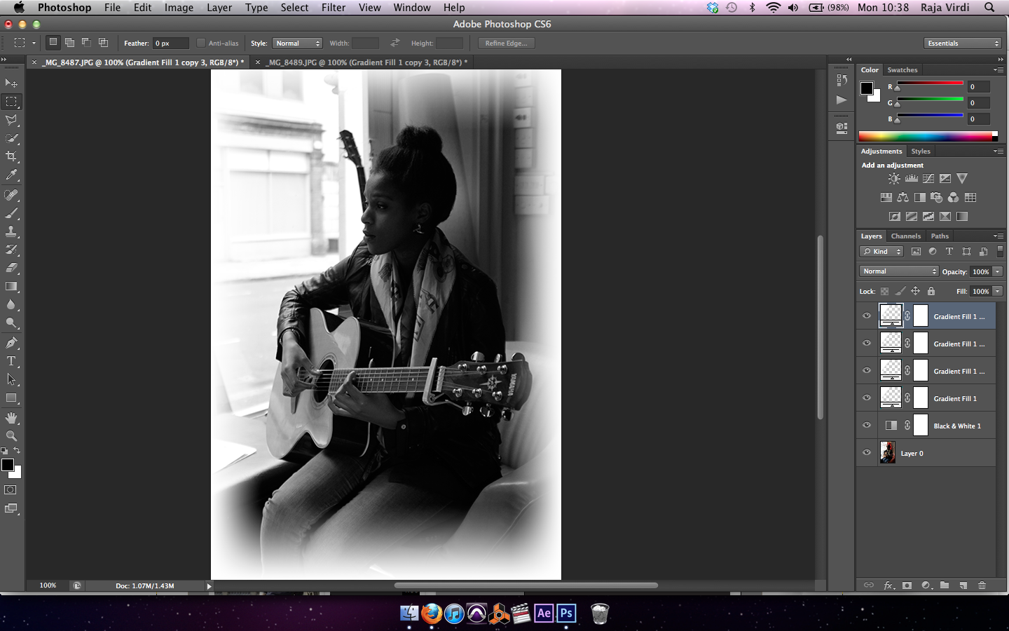
For the main photo at the top, there were quite a few steps to creating the final image. Firstly, the lens we used to take the photo wasn't a very wide aperture, so we didn't have the nice blur in the background so we had to create it artificially using the "Lens Blur" filter in photoshop.

In order to make sure the main photo of Joy wasn't blurred, I had to use photoshops magnetic lasso tool to cut around Joy. I also added a feather of 2 pixels so everything flowed with the background. Another feature we added was a brightness/contrast feature because the shadows were a bit harsh in Joys face - so using photoshop we put the brightness up so make it look more even in her face.

The final step was to add a gradient to the sides of the image. This was done so on the website it looked like it was part of the white background as apposed to a static image at the top of the page. By adding a linear white colour gradient in photoshop, it enabled us to have this great looking effect.

-----------------------------------------------------------------
With the edits we thought of, this is the first concept we came up with. Firstly, we made the overall image a lot smaller so the page didn't scroll horizontally. Also, we moved the main box with the information further down the page so it didn't clash with the main photo.

By moving the main box further down it meant we could make it longer in order to add more information. For example, we now could add a second video to the page to promote more of Joys videos. We also had a larger space for more events and could make the "New Album" photo slightly larger so it is a main focus. Another thing we could now do is make the Soundcloud music player larger so the viewer can see what song is being played and how long it is. The problem with the website at this stage is that we have a lot of space left at the bottom, right hand side.

-----------------------------------------------------------------

At this point, we decided after lots of research we could add a "News" section to the website, but the problem with Wix.com is that we couldn't have lots of text in a scrollbar which was quite annoying so we had to think of an alternative. Another problem we encountered here was that we felt everything was a bit squashed and needed a bit more space.

-----------------------------------------------------------------
Firstly, we moved the box to the left hand side to fit with the edge of the photo and the plan was that we were going to have images of Joy along the side.

Instead of using the text for the news, after searching through Wix.com - we found that you could add a Twitter widget which meant we can connect it to Joys twitter page so she can post what she needs to and people can follow her.

-----------------------------------------------------------------
At this point, we needed to edit the photos to fit on the side on the page. We did it in the same way as the main photo was done. We aded a gradient around the sides of the image so it flows with the white background but we felt we could do something different with it.

We felt that by turning the images black and white in photoshop, it is something a bit different and with the way the photos were taken with the shadows, it looked really professional.
The final product looked like the image below. We thought it looked very professional and worked very well. We tried different sizes of each image and in different places but we felt keeping them the same size and under each other gave a much better effect.

-----------------------------------------------------------------
At this point, we felt we could change the website even more. After looking at other websites we thought that having the only two photos at the side is a bit strange and could be incorporated into the main information box itself. Another idea which we are currently looking into is maybe putting a Flickr slideshow in which goes vertically down the page. We feel that will be much better because it can hold lots more images and would gain us extra marks. With the box bigger, it means we have more space to use for other sections if needed. We also moved the overall box down because it was cutting a part of the guitar off, and we made the box horizontally larger so it was aligned with the edges of the main photo at the top of the page.

We would ideally like to add a Flickr widget vertically down the side with the photos. We feel with that, it'll look very professional and will finish it all off.

-----------------------------------------------------------------
We added a different slideshow to the side of the page, using Wixs' "Flickr" widget, however it didn't look professional, took up most of the space and the widget itself didn't work with custom photos so it was unusable.

However, we came up with a different idea, by making a vertical slideshow of images we can upload ourselves (as seen in the photo below), it also meant we had space for one more section which we will decide what it can be after more research into other websites. This slideshow looks more professional and can store much more images. The user settings for example speed of the slide show and automatic sliding is also a great feature!

-----------------------------------------------------------------
We have updated the "Photos" section by adding photos of Joy from the pictures we took of her from the video shoot. We could also add captions to each photo to say where it was taken, etc.

We have also changed the "Other" section to "Contact" as after research some home pages have a contact form section to get in touch with the band/artist. We felt this was a great way to add some more communication with the audience along with the live twitter feed. We also updated the "Music" Soundcloud player with Joys official Soundcloud so it plays all of her songs.

-----------------------------------------------------------------
At this point, we feel that the website is very good, professional and has everything a Home page will need for an audience to find out more info about the artist along with promotional links for the music video and CD.
Monday, 5 November 2012
Shooting Dates
First shoot filmed: 13th October - Jam Cafe in Nottingham, filming Joy's performance and part of narrative. All 3 props - rose, camera, letter. Actors - Annie and Joy.
Second shoot filmed: 23rd October - Wollaton Cemetery, filmed part of narrative. Letter and Annie. Annie wears black clothing and has a black hair bobble.
Next filming: 3rd November - Wollaton Park, sunset, last scene. Camera, Annie and Eliot.
Next filming: 4th November - Jam Cafe, first memory narrative. Rose, Annie and Eliot.
Friday, 2 November 2012
CD Cover Design
Here is the cover we have designed for our artists CD. After doing a lot of research into similar genres CD covers, we felt this is the best interpretation.
It's the first concept idea for it, but the general ideas are here. We wanted to do a lot of black and white so we used photos we took on the day of shooting and used them. We did some editing such as facial smoothness, blurring backgrounds, making a gradient round the edges of the photos and so on.
For the front cover, we used a lot of white so we felt we had to contrast it by using black text. The handwritten font is also very much conventional with this Indie genre. For the photo used, we felt this was the best one we took of Joy and it looks very professional.
The back cover is the only image with colour being the red rose. We used this image we took because in the video it is one of the main props and we felt we needed it because it creates a theme of love and loss. We kept the back cover very simple like other CD covers were. We used the same font as the front cover and positioned the text in the middle. We also included the websites to find Joy at along with a bar code.
For the inside cover, we kept this extremely simple with only one photo of Joy outside the Jam Cafe. After looking at other similar genre conventions of CD covers, they all had one photo with minimal text. As for the CD itself, we used a victorian pattern gradient and just put our artists' name and album title.
Overall we think for a first effort, it looks visually pleasing and fits the website and all around theme very well. If we were to improve it, we could do something with the inside cover - maybe adding text.


We have used the ideas and effects from Jessie Ware's digipak because we liked how the contrast of the black and white overall creates a professional effect and makes the important text and photos stand out.
We liked the use of the fade across the face of Jessie Ware in the front cover and we have used this fade effect on our photos.
We also liked the layout of the front cover where the photo of the artist is centred and the title and album name is at the top and bottom of the page. We have used this idea for the layout of our front cover.
For the CD, we wanted to keep it simple like the CD for Jessie Ware as this goes with the theme of the whole digipak because it is using the same contrasting colours and also the text stands out clearly. The text on the CD is the same font as the rest of the digipak to follow the theme and this is the same as the CD for Jessie Ware.

____________________________________________________________
We decided that having the rose behind the text was hiding it too much and it didn't bring out the colour of the rose which represents love. We decided to have the rose separate to the text of the song list as then we were able to bring out the colour and add effects such as an inner glow to make the rose look delicate and meaningful and also to give it a faded effect like we have for our photos.
We arranged the text of the song list at the side to look presentable on the page with the rose.
We also thought that we would add a bit more colour to the digipak so that it went well with the colours of the rose. We made our inside cover in colour because it has lots of different colours in this photo of Joy outside the Jam Cafe and this is where she performs so there are different feelings and moods associated with Joy and this location. We thought that having the colours in this photo would convey these moods and emotions.


Subscribe to:
Comments (Atom)