Question 2:
How effective is the combination of your main product and ancillary texts?

Here is our website design. We decided to make it as simple as possible in terms of colour and information on the home page, simply because the general conventions of websites from the same genre of our artist had the same simple layout design.
To fit with this convention, we felt we could do the same. However, we did challenge the convention by adding different parts to our home page which other websites did not have. For example, we added a "Contact" box which enables fans to contact Joy directly - quick and easier than looking for where the Contact section would be. Furthermore, we also had a Soundcloud player in there, so people can listen to Joys latest music. Again, this is something which other websites we looked at didn't have and is extremely vital for promoting the artists' music.
Generally, there were many conventions we did follow, for example the photo at the top. All of the websites we looked at had a large image of the artist/band. We had to do some editing for example, blurring out the background in photoshop so the focus is on the artist only. However, if we were to change anything it would be too have the artist look down the lens - which is what we found in most website photos. Also following conventions, there is a "Latest Releases" section, so fans can stay up to date with the artists' music and places to buy the music. This is the same with the "Events/Gigs" section, so fans can see where the artist is playing next and buy tickets & the "Videos" section, so people can see the music video and other videos the artist has done.
The most important thing, we felt, on the website was the links to social media sites as well as having a Twitter widget on the website as Twitter is the new way of artists to communicate with fans so this was extremely vital so people could easily follow Joy on Twitter, to find out the latest news.


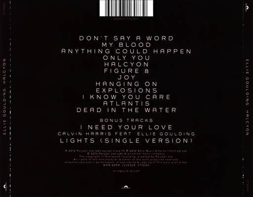
For our CD cover, we had a very basic first design (which was very different to our final design). It had many problems such as that the photo of the artist wasn't clear and it looked quite messy on the back cover. After looking at similar genre CD covers (eg Ellie Goulding & Jessie Ware), we found that the artist is always on the front cover and is usually a close up/mid shot of their face either looking away or looking down the lens. We felt we had to go with this convention, so we took photos of our artist again (in the same location we filmed her performance parts at, so it all interrelates) and we made sure she looked down the lens.
Also, we decided as the guitar was the primary instrument in the song we did the video to, we felt this would create a better image for our artist. We also changed the font from our first CD cover. We did this so it was easily readable and was clear. Again, this was a convention for our genre of CD covers. As for our back cover, we deiced to go for something which relates to the video, again like the front cover does. So we went with the props from our video which trigger the memories. We felt these images came out extremely well and professional - especially with the bright lights out of focus in the background which just adds a bit of colour. For the CD itself we felt using the guitar sound-hole would be a great idea and would fit the artists' image perfectly. This was because she is playing the guitar in the video and has it on the front cover so our cd & video all moulds together nicely.
We have two different CD covers because we felt they both bring different emotion to the look. The more black and white one looked a lot more professional and we felt worked well with the style of the video. However, after taking the black and white filters off, the colour ones looked very warm and created a more happy feeling. As for the back cover, the saturated look was great and the way the blurred out lights in the back looked, felt really professional to us.
We feel we have maintained a clear image/theme throughout the campaign, as well as interrelating into the video. Firstly, in terms of colour we found from research of similar genre, CD covers and websites, that simple bright colours worked the best (e.g Mumford & Sons & Bombay Bicycle Clubs CD covers & websites).
For our websites we used a lot of white, grey and yellow/gold for the writing. These bright colours do give emphasis to the theme of the music video which is love and loss, and on the note of the video we used a lot of yellow tints to give the vintage look which all fits around the same kind of colour we used for our website writing.
As for our CD cover, the front cover (colour version) uses the yellow for the guitar as well as the lights in the background & the CD itself which is just the guitar - so there is a continuous theme of colour running through. Where we really emphasised colour was on the back cover, where we had the out-of-focus lights in the background which gave it a more happy feeling - especially with the over saturated look. This theme of happiness also relates to the main theme of love in our music video.
We felt that colour representation was vital for the campaign to flow and have a clear image for our artist. Also, the use of colour targets the audience as we want to represent colour as a feeling for them, and to keep that continuos theme of colour showing love and happiness throughout the video.

This still image from our video is showing how colour is represented. The background lights which are out of focus give quite a happy feeling to our theme. We also carried on with the yellow, as you can see in Joys face, we added some yellow/gold tinge for the vintage look. Also the background lights were used on our back cover to give it more colour and depth to the image.

We also incorporated a much darker yellow tinge here as you can see on the walls and in the face. We felt this was a moment in the video which was sad as we needed to try use darker colours to compensate for that. Much like on our website which has "Joy" at the top written in a darker gold than the rest.

We also felt the scene from our video with the sunset is an iconic moment in the video. Generally, sunsets are quite happy and romantic moments where couples are together. We followed this convention and made it a happy time for them. Colour representation is also found here along with our website and CD cover. As we can see we have three different types of yellow and gold which resemble happy and sad moments in our videos, which are two of our main themes.
Furthermore, we also maintained generally a clear image of our artist. For the CD cover, we had her looking down the lens compared to her looking away in out first design below.


This first CD cover (first image) we did was relatively simple - which is what we wanted, but it didn't work with our video because she looks down the lens in the video so it wasn't really selling the artist to an audience. However, by changing the image to her looking down the lens it immediately draws an audience in, much like the music video, so it seems like she's singing to the audience. This creates a relationship between the artist and the audience which is exactly what we want in order for our themes to work well towards the audience. However, with our second CD cover test (second image), we print screened stills from footage of the video performance and immediately, it draws an audience in as we can now see Joy. Also, the idea of the back cover (having the props from the video), came from this.

As you can see here, the still from our video showcases the props on the table. This is where we took the photos so there is continuous theme running through our CD cover and our music video.
Like I've said, the props used in our music video, (which is a very important part in the whole video and narrative), of which trigger memories, is the best idea for a back cover as they interrelate between the video and CD cover, so the target audience can see the similarities between them. The only convention which wasn't the same is the website photo. The photo we used was of Joy looking away from the camera as apposed to looking down the lens like our CD cover and music video was. However, we did feel this worked quite well with the website and still gave the same continuous image for our artist - which is the main thing.

Even though our artist was looking away, the still from our music video showcases her playing the guitar which she does throughout the song. As our website image shows her playing the guitar as well as on our CD cover, they all tie in very well with each other, creating a continuous theme.

Ellie Goulding's CD cover was a cover which we really liked and felt was the route we would like to take our cover in. There are many reasons why we liked this cover; firstly, we felt that the image was very strong and gave the artists' image and genre straight away. The use of the close up of her face drew use in as well. This is where our inspiration of a close up came from as well. We slightly challenged this CD cover as we had our artist looking down the lens as apposed to away (as seen in the image below).

This, in my opinion, helps sell the artist that little bit more as you have that eye contact - which as I said before draws the audience in. Furthermore, the use of the bold text, contrasting against the black and white photo makes it easy for consumers to see what the CD is called and the name of the artist. Again, we feel these small things help sell the artist as a consumer wants to know what they're buying and who the artist is. With our CD cover, we did the same thing where we had bold text which contrasted against our photo so a consumer could easily see who the CD is by.
For the back cover, we challenged this simple background. As we wanted our covers to interrelate between our CD cover, video and website, we decided to use the props as our photo. However, because of the simple front cover, it would overcomplicate it by adding images on the back. Instead this cover simply shows the song titles in a very vintage font. This will help sell the artist because a consumer simply wants to see which tracks are on the CD as apposed to songs maybe being unclear due to photos on the back, taking over.

Jessie Ware's CD cover was also a very big inspiration for us because of the simple design and again, like Ellie Goulding's - the very direct image of her on the front. The conventions are very similar between them and our CD cover. The text is very clear and is contrasted against the black and white background. However, on the back, it seems the text is quite small and un-clear. This is something we didn't do with our back cover. We made it very clear which songs are on it by having large spaces in between the songs and by making it the main focal point of the back cover, as you can see in the image below. We made sure our photo was quite out of focus, so again, the text was the main focal point.


Jessie Wares website was a big influence for us for a few reasons. It was mostly due to the colour, text and the image. Firstly, with the colour - much like with our video and CD cover, we wanted to go with simple colours like white. We felt this makes it easier for a consumer to find parts of the website, as apposed to having a lot of colour which can distract from the information. We feel this is the reason why the website sells Jessie Ware so well, because everything is laid out very nicely, for consumers to find information, Differently, we opted to put a lot more on our home page for example a video section, photos, CDs, gigs, etc. This is something Jessie Ware didn't do but other websites like Mumford and Sons & Bombay Bicycle Club did.
Also, the way text is shown is very professional as well. The Jessie Ware text interrelates between her CD cover and her logo on music videos. This could be why she also sells a lot, because this online image is constant. Much like our CD cover & website, we kept the font the same so it creates a consistent image for the artist.
Finally, similarly to Jessie Wares, we used the same type of photograph. As you can see below from our website, Joy is looking away from the camera. This is something we took from Jessie Wares website as it gave a very elegant look, however, we felt it could be the look we weren't going for as we want to be consistent with our CD cover and video. However, as we have the guitar in it, Joys image is still generally consistent as we have the guitar in the music video and CD cover. Also, with Jessie Wares the main focus of the image is on her, we did the same by creating a shallow depth of field of only our artist, so consumers see her straight away.


Mumford & Sons' website was a huge influence for our information on the website. As they are the same genre as our artist, it seemed like a good choice to base our ideas on. Their website is slightly different to Jessie Wares and ours in that there is no image of the band - only their logo. However, there is a consistent theme here as their CD covers are mainly their logo as well as a lot of their videos showcasing their logo in the beginning, so there is a consistent theme. We felt we could join both conventions together and have something a bit different which captures an audiences' attention.
We liked how they split there sections up - in boxes. We did a similar style as you can see below for our website. We changed this slightly by putting it all into a box and splitting our sections up with headers, which we felt looked neater and went with the image of our artist better. In terms of sections they have and we have, they are very similar. We both have a "Releases" section. This is very important as consumers need to know what the latest releases are if the artist/band. However, we changed this by having links where you can buy the CD, whereas on Mumford & Sons', there isn't. This could hinder their selling of albums as consumers don't know how to get the album.

They also have a "Tour" section, like we have a "Events" section. This is important as well as consumers need to know when the band is playing in order for them to make money off ticket sales. They also have a section where you can buy tickets. This is something we didn't have on our website as we felt it was unnecessary, as tickets are usually sold by our artist herself. The only other similarity is that, they have a Facebook page widget on the bottom where fans can add them and talk to them so they are kept up to date with the latest news. We did the same but used Twitter as we found it was easier and more popular for users to use. This will definitely help sell the artist as they will always want to stay connected to their fans.
No comments:
Post a Comment