We decided to develop our ideas for our CD cover as we were adjusting our idea for our music video and we also weren't happy with our first digipak idea.
For the front cover we looked at other artist's CD covers such as Ellie Goulding and we found that most of the CD covers were closeups of the artists. We liked Ellie Goulding's CD cover because of the wind swept hair look and we sketched an idea of this for our CD cover. We also sketched ideas of closeups of Joy and you see her guitar in the background. Another idea was to have a table with a teacup and a cake on it to relate to one of the songs on the album called 'Cake & Tea' and we wanted to follow the cafe theme.


We still had the cafe themed idea in our heads, so for the back cover we wanted a table with a tea cup or maybe some of the props on the back and then have the track list either at the side of these objects going down the table or over all of the image still going down the table.
One idea for the inside cover was to have a table with fallen rose petals on it but when we put the picture in black and white in photoshop, we didn't like this idea as it didn't convey the themes of loss, love and memory and it also didn't look very much like rose petals.

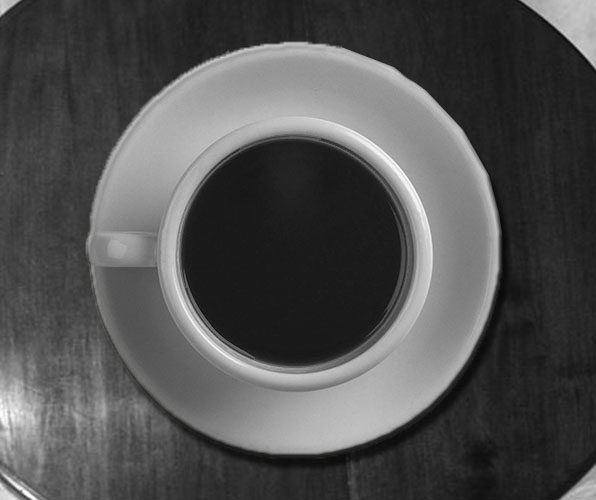
We explored using the petals on the table on photoshop but didn't like this so we tried using a cup of tea from above as this relates to the cafe theme and is also in the music video and it relates to her song 'Cake & Tea'. This is a tested version just to see what the image would look like so we will take the picture in the cafe thinking about the composition and lighting more professionally. This image could either be for the inside cover or maybe for the CD.
We tested out some of our ideas in photoshop from our sketches and tried to make the front and back cover look professional and similar to what we have in mind for our proper one. We used a closeup of joy that we took on our first shoot and we used this because it has her guitar in the background too. We added a lens blur in the background to make Joy stand out more and we put the text on top of the image to see what it would look like. We will take a photo of Joy looking at the camera and take a photo of Joy with a slight wind swept hair look to let the viewer engage with Joy more.
We used a photo we had of the items on the table for the back cover so that we can see what our objects on the table looks like as a back cover. We added a lens blur to the background of the table so that the objects stand out to the viewer and then we put the track list on top and we liked the look of this. However, we will take a more professional photo and more thought about photo for this back cover and we can think about what objects we use and the composition of the photo so that the track list looks good with the objects.

No comments:
Post a Comment