Wednesday, 31 October 2012

Website Design


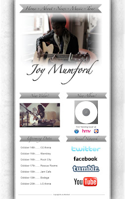
Here is the initial idea of the website we would like to create. I have designed a basic idea using Photoshop CS6 and a few images from google and screen-grabs from our performers videos. However the main photo was taken by myself on our first day of filming.

With other website home page research done from other artists of the same genre, there were many of the same conventions for example the colour of the websites were bright but quite plain. For example Jessie Wares' homepage was plain white with a photo of her on it. I gained influence from this in order to create this first concept idea. The greys and whites are the general conventions for an Indie type website.

Another convention which is the same is the amount of images of the artist themselves. In all the websites we researched, they only had one big main image of themselves - usually at the top. So we went with this convention and put the main photo right at the top. Something to possibly edit in other concept ideas is maybe turning the main image black and white to fit the background better.

We have added an Upcoming Dates section for gigs for our artist. These will be links which can be taken to the website in order to buy tickets and get more information. As well as this we also added other sections like social networking which is incredibly important and these will also link to our artists' Twitter, Facebook, Tumblr & Youtube pages. In terms of news and updates, we have added to columns at the top which are the New Video and New Album. As we are promoting the music video we are creating, having that at the top is very important as well as the CD we are also promoting - which will have links to iTunes, HMV, Play which you can purchase it from. Other websites have exactly the same conventions for example Mumford and Sons' website have their latest album section at the top so people can purchase it and find out more information.

Overall, we are very happy with this first initial idea and will be critiquing it, in order for it to look the most professional and most informative for our target audiences.


Website Analysis & Research


There are many images of the band, some are set up photography photos, some are performance photos and some are photos that the band have taken themselves of each other to show their fans what they're really like. The title of the band's name is their signature font and and is in the top left corner with the banner following it. Their website is more about the promotion of them than their music so it doesn't really follow their genre of music. There are link to social networking sites such as Facebook, Twitter, Youtube, Google+ and MySpace. There are also options on the posts 
to either like them on Facebook or retweet the posts on twitter. This is a good way of promoting them. The colours of the website contrast each other as it has a light beige background with dark text to stand out to the reader. This also contrasts with the photos that are in colour and it makes you look at the photos of the band and this promotes them more. The posts and tweets are written as if the band have written it so that the fans feel like they are closer to the band than they actually are and this is good for promotion. There is an advertisement for the band's album to buy it on iTunes and this is appropriate to the target audience as it is promoting the band only.

 The website for Mumford & Sons doesn't have photos of the band apart from one photo of one of their album covers for advertisement. There are some logos at the bottom of the page which are companies and sponsors. It is different to a normal band website as it is about things that the band are interested in such as food, so it fits the genre. There is an option to like the band on Facebook at the bottom of the page and all of the links are appropriate and have the right amount of information. The colours are blue and white as the blue background contrasts the white boxes with blue writing in and this makes the writing clear and easy to read. The written content is more personal to the band as it is one of the members of the band talking about his cooking. This can help the fans to relate to the band more. There is an advertisement for an album of the band and also for a documentary and a dvd of the band and this is promotional so it is suitable for the target audience.

Jessie Ware's website has a big photo of herself filling up most of the page and this obviously promotes herself quite a lot. This also follows the genre of pop as their image is about themselves. She has links to websites such as Facebook, Twitter, YouTube and SoundCloud for promotion. The colours in this website are black and white like on her album and it conveys delicacy and elegance. The only written content on this website is the links and the artist's name at the top. The only advertisement is to buy her album on Amazon but this is suitable for the target audience.


This website for Ben Howard has his name in the same font and style as it is on his website, also there is two images and options to watch his music videos. This relates to his genre as it is more about his music than himself so he has videos and performance photos to promote his music instead of photos of just him to promote him. There are options to view the artist on Facebook, Twitter, MySpace and YouTube. The links at the top have enough information for a fan to find out. The colours are similar to the digipak so it relates. There is a section where he has written reasons why his week was good and reasons why it was bad and this helps the fans to relate to him and feel closer to him. Most of the website is taken up by his music videos and this constructs his image more as he is clearly trying to emphasise the importance of his music more than him. There is an advertisement to buy his album on iTunes and this is suitable for the target audience. 

There aren't any photos of the band or logos on the website but there is one of their music videos. Bombay Bicycle Club are acoustic so it is more about their music than themselves and this is shown from the lack of photos of them. There is an option to view the band on Twitter, YouTube and Facebook and the links they have are appropriate for a band website. The colours are black and white and this helps you to see the links and text because the colours contrast. The only written content is the links and the band's name and this keeps the website simple so that you can easily see what you went on the website to look for. There is an advertisement to buy their album and also there are links to go on amazon and iTunes to get their music, this is suitable for the target audience.

Target Audience Demographic Analysis Report

We have done a target audience demographic analysis report for our music video. This includes our target audience age, gender, subculture, audience build up, social class, sexuality & psychographics variables. Also shown is how we will target these and how we have come to the conclusions of our answers. Generally, we have talked about the themes of love, loss and acceptance and how they will affect our suggested target audiences.


Casting List & Locations

We have casted our actors already and have their details on our Casting Sheet. We have also sorted out the dates we need them for the shoots as well as our production checklist making sure we have got our equipment, props, booked locations and arrived meeting times.


We have also wrote our locations and the dates of filming in each location with transport methods to get to the locations. We have also got written down the equipment and props needed for each location making it easier to remember dates of filming and what we will need.


Advanced Portfolio Digipak Cover Research


The Script are an alternative group so their image isn't all about themselves, it's more about their music. On the front and back cover most of the space is taken up by hands and this relates to the music more than just showing the band. On the back cover it looks like the hands are praying and on the front cover it look like two different people holding hands so this could relate to love. The album is called 'Science & Faith' and this title is conveyed by the praying hands, symbolising faith and also on the cd there is a symbol that relates to science. On the album there are songs about love such as 'This = Love' and 'If You Ever Come Back' and this relates to the holding hands on the front cover , so this digipak relates to its songs and is very appropriate for the meaning of the songs and image of the band. Even though their image is more about their music, there is a photo of the group on the album case but this is to sell them to the audience as people would want to see what they look like and knowing who they are would help to promote them more. The theme of colours in the whole digipak is brown and gold colours with black to contrast it. The colours are similar to the hands and also the band are in a desert-like place in the photo of them and are all wearing black to contrast and this goes with the theme of the whole digipak. The band's name is at the top of the front cover and is in black to contrast the background colour of light brown, and it stands out enough for anyone to notice the album as theirs and this helps to promote the group. The hands on the front and back cover take up most of the space on these covers so therefore the hands are the main focus of this album as it relates to their songs. However, on the back cover the track list is in the corner and is quite small, it is not too hard to read the track list but it is not very obvious and it doesn't collide with the image of the praying hands so this would make the hands look better and stand out more. The font of the album title and the track list is the same and it is simple like the photos of the hands are simple. The font of the group's name is the same font as other albums and posters of them so it is like a signature font for the group and this helps to promote them.


The genre of Mumford & Sons is indie so their image is individual. In most indie digipaks they would be simple and convey the own artist's individual image and style. Mumford & Sons have used a plain white house with a shop window as their theme across the digipak and it is an individual building on the street as it stands out as being different to the other buildings next to it. Also the building is white and this relates to one of their songs 'White Blank Page'. The cd is also simple as it is plain black and the writing on the cd is white and this goes with the white house, so the digipak works well together. The composition on the photos look good as, in the inside cover, all of the people in the band are sitting in their own window and are shown to be as equally important as each other because not just one of the people in the photo stands out, you look at them all equally as a band. The title of the band and the album title are at the bottom of the front cover and are typed in black to contrast with the white behind it so that it stands out and you can clearly see the text. It is in the same font as the track list on the beach so the digipak goes well together, and the track list is in black and contrasted on a plain white background as is also easy to read. The band are portrayed as different and fun as you wouldn't usually see people all standing in an empty shop window looking like shop models and also you wouldn't see four people sat on different window sills playing instruments and this individuality helps to sell the band.


The genre of Jessie Ware is pop-soul so the image of the artist is more about them. The colours of this digipak are white and black and this keeps the digipak simple and this creates a theme to make the covers and the cd go together well. There is a photo of Jessie Ware on the front cover that fills up most of the cover and this conveys the image of herself and also promotes herself to the public as you can see what she looks like. Her look in this photo is quite smart and delicate and this reflects some of her songs 'Swan Song' and 'Sweet Talk' as these song titles represent delicacy and sweetness of a person. The font is the same for all of the text on the digipak and this keeps to the theme. The artist's name is on the front cover, the back cover and also on the cd and this promotes her more. The track list is in the centre of the back cover and contrasts the black background as it is in white font, it takes up most of the black box on the back cover so it is the main focus of the back cover.

 
Ben howard is also indie like Mumford & Sons so his image will be more about his music than himself and will be individual to his style. The digipak is quite simple as the front cover is of him under these, the back cover is plain white with black font to contrast it, and the cd is plain black with white font to contrast it. The front cover seems to be symbolising nature as the sea is natural and this relates to some of his songs 'Old Pine' and 'The Wolves'. The person in the sea is swimming downwards but has his head up and this relates to the song 'Keep Your Head Up'. The artist's name is on the top of the front cover and is in quite big font and this helps to promote the artist. The font of the track list, the cd text, the artist's name and the album name is all in the same font and this makes the digipak go well together. The artist's is portrayed as different and his own self as he is swimming in the sea on his own in his own world and enjoying his own company and this reflects on his songs and promoted his image and style of music more.


Bombay bicycle club are indie and acoustic so their image is more about their music than themselves. The images on the digipak symbolise the brain and the senses of people and this relates to some of their songs 'Your Eyes' 'Lights Out, Words Gone' and 'Fracture' as these song titles represent parts of the body. The plain blue background of the outside covers contrast the light colours on the people's heads and this makes the heads stand out so that they are the main focus of the digipak. The font of the album title and the track list are the same and they stand out more than the rest of the text as they are what is important to this album. There isn't any text on the inside cover or the cd, it is images what is meant to be the brain and senses and this relates with the theme of these senses. The band's name is in a small font but is centred at the top on the front cover so you cans see who's album it is but you don't focus on it as the importance is on the music more than the band. There also isn't any photos of what the band look like so they aren't promoted in this way. The style of the digipak seems to be of drawings of the senses in the body and this is different and indie like the genre is, and the band are promoted through their individuality.

On our digipak for the music video we are creating we would like to convey getting over someone in a relationship as this is what the song is about and we intend to show a girl getting over the death of her boyfriend in our music video. The genre of our artist, Joy Mumford, is indie so we intend to create a digipak that shows Joy's individuality. We are using props in our music video that relate to the memories of the boyfriend so to link this with our digipak we will use some of these props on the covers. We would like to have a photo of Joy with her guitar outside the cafe where she sings and this cafe is white which symbolises innocence which could be a theme for our digipak as there is innocence of the girl and the boyfriend was an innocent person who died. Also, the cafe is where Joy performs throughout the music video so this relates and this is where she is comfortable playing. The cafe conveys Joy's image as it is seen as a part of her life because it is where she goes to sing and think. This is also important as this cafe is where the girl in the music video is looking at all of the items and goes back to certain memories of her and her boyfriend. We will have the text of the artist's name and the album name in black at the bottom of the front cover to contrast with the white cafe and make the text stand out. On the back cover we would like to have a plain white background to follow the theme and have a rose on this cover as it is one of the items in our music video and a single rose can portray a lot of feelings and emotions such as memory and romance. We will have the font of the track list in black to contrast the white background and we will have it above the rose as having the rose lower down on the cover can convey loss which is what we want to do. The cd will be white to follow the innocence theme and there will be black text to contrast this white and it will be the artist's name and the album title. The cd will be simple and having the artist's name on the cd will help to promote her more. The inside cover will have a picture of the couple watching the sunset on the hill as this is in the music video so it will relate and also it symbolises romance like the rose does and this is a theme in our music video also. We would like this digipak to convey our themes from the music video and to promote Joy and her music from this.

Drawn Music Video Storyboard

Along with our written storyboard, we have also added a drawn storyboard of a 8 shot excerpt. We have chosen the scene of our actress leaving the Jam Cafe and going to the first location on her way to acceptance. We used this scene because it's the part where she accepts the death of her loved one and is an important scene in our music video.


Tuesday, 30 October 2012

Recce 3 - Wollaton Park

Location 3 - Wollaton Park

Address:
Wollaton Park, Wollaton, Nottingham NG8


General Description

This is a very large park located in central Wollaton.


We will be using this location for our second memory sequence of which we see our actors on a hill - a sort of date. We simply see them together. For this we want a sunset preferably to give a more romantic feel to the scene. This is also where the final scene of the music video will take place which is where the actress accepts the death of a loved one. 

It is available to the public and we have already had permission to use the location.

Lighting 

The site is very well lit in the day due to natural sunlight. We aren't using it at night as we don't need to film then, so the day is a great time to have good lighting.
If we do need extra lighting, I can provide my own battery powered ones.
The camera will need white balancing but we will be using a diffusor which can be used for white balancing the cameras we are using.

Sound and Noise

There is some background sound from people around but as music will be playing in the background throughout it will not matter for the music video.

Health and Safety

The location checks out perfectly fine with health and safety with no hazards, machinery, power lines, etc.

Location Score

Suitability - 10/10
Public Usage - 4/10
Power Supply - None
Space to Move - 10/10
Lighting - 8/10
Sound & Noise - 5/10
Health and Safety - 10/10

Photos


Our Own Images


Recce 2 - Cemetery

Location 2 - Wollaton Cemetery

Address:
Wollaton Cemetery, Wollaton, Nottingham, NG8General Description

This is a medium sized cemetery located in central Wollaton.

We are going to film the "present day" & "past" narrative sequence of which our actress goes to the grave where a loved one has died - which is the past. She is about to put the letter (one of the three props) down, but instead leaves. The next sequence is the present day, when she leaves the Cafe to go to each location to put the items back. She puts the letter down and leaves.

It is available to the public and we have already had permission to use the location.

Lighting 

The site is very well lit in the day due to natural sunlight. We aren't using it at night as we don't need to film then, so the day is a great time to have good lighting.
If we do need extra lighting, I can provide my own battery powered ones.
The camera will need white balancing but we will be using a diffusor which can be used for white balancing the cameras we are using.

Sound and Noise

There is background sound from cars as we are near a main road but as music will be playing in the background throughout it will not matter for the music video.

Health and Safety

The site checks out perfectly fine with health and safety with no hazards, machinery, power lines, etc.

Location Score

Suitability - 10/10
Public Usage - 2/10
Power Supply - None
Space to Move - 10/10
Lighting - 9/10
Sound & Noise - 5/10
Health and Safety - 10/10

Photos


Recce 1 - Jam Cafe

Location 1 - Jam Cafe

Address:
12 Heathcote Street, City Centre, Nottingham, NG1 3AA

General Description

This is a Cafe, located in Nottingham City Centre.

We are going to film the "present day" narrative sequence of which our actress gets the 3 props out and each triggers a memory. We will be doing cut backs between the present day and the memories after each one. Also in the Jam Cafe will be Joys performance clips. She will be performing on a stage nearby and we will get all her shots at the Cafe.

It is available to the public and we have already had permission to use the location.

Lighting 

The site is very well lit from lamps around and main celling lights however Joys performance shots will be nearby a large window enabling us to get natural sunlight in as a fill light.
If we do need extra lighting, I can provide it as I have my own studio lights, but I doubt we will need them in this location.
The camera will need white balancing but we will be using a diffusor which can be used for white balancing the cameras we are using.

Sound and Noise

There is background sound from people around who are in the Cafe too, but as music will be playing in the background throughout it will not matter for the music video.

Health and Safety

The building checks out perfectly fine with health and safety with no hazards, machinery, power lines, etc.

Location Score

Suitability - 9/10
Public Usage - 4/10
Power Supply - Yes, there are many (but we have many long lasting batteries for our cameras)
Space to Move - 8/10
Lighting - 8/10
Sound & Noise - 5/10
Health and Safety - 10/10

Photos


Actors' Test Shots


Name:
Annie MacArthur

Make-up:
Very simple & natural make-up. For the chosen narrative, we don't need any extreme make-up or effects as it's supposed to be natural and more of a "every-day" kind of look.

Hair:
We can change the hairstyle for different narrative scenes. If we feel that having her hair down for some narrative scenes will be better, then we'll go for that, however, having it tied up could also look good for a different effect.

Style/Colour:
We will be using simple clothing, again for a more natural & every-day kind of look. However with colour, we are going to symbolise different colours for each memory. For example she will be wearing black clothing at for the narrative scene at grave (to show darkness/emotion) & red clothing on the date scene (to show love etc).

Influences:
We felt the natural look came from seeing other Indie artists' music videos, for example Gabrielle Aplin as she is wearing a simple dress in her video for "Home". For the narrative scenes, to have colour emphasising different feelings in that moment in time, we thought of that ourselves as we wanted some sort of symbolism in our video.


Name:
Eliot Rice

Make-up:
We will be using minimal make-up (if not any) for Eliot, as again we are going for a more natural look. Generally, males in Indie music videos don't tend to wear a lot of make-up apart from hiding blemishes, which if needed can be sorted out before the shoot.

Hair:
The hair will be very much the same for Eliot as he's only in two scenes and changing hairstyle wouldn't really have an impact on the video, so we feel we can keep it as it is.

Style/Colours:
We are going for a more Indie look for Eliot so something very casual for the date scene. However, we may also use colour of clothing to our advantage because we can use blues and such to show Eliots' characters emotion in the narratives and how they differ from Annies' character.

Influences:
Generally, the influences are simply what we see around us - in terms of how males at the teenage age  dress and how different styles can affect an image.


Monday, 29 October 2012

NVC - Non Verbal Communication


  • Costume
  • Posture
  • Gestures
  • Facial Expressions
  • Space (use of space in location - distance of performers to camera)
  • Voice - change to pitch/tone etc
The costume of the actress represents the feelings of the song and how the actress would be feeling at each memory in the video narrative. We intend to show these feelings through the use of colour within the costumes, for example, when the actress visits the grave her mood is upset and to convey this we will make sure that she is wearing something black. Also, we want the actor to wear something red on the date on the hillside because this represents love, romance and happiness.

The posture of the actress will also change throughout the video, for example, when she first meets the actor her posture will be quite formal as it is a first date and her feelings are nervous. To represent this she will be sitting upright and looking shy whereas in the date on the hillside she will be more comfortable and open to the camera and the actor.

The gestures will help to guide the narrative because the props we are using signify gestures. For example, on the first date the actor gives the actress a rose which symbolises him expressing his love. On the hillside date the actress uses a camera to take a photo of the actor, this gesture portrays her emotion of how she loves the actor and this adds to the mood of this memory which is happiness and love. 

The facial expressions clearly show how the actors are feeing at specific moments as we convey these with lots of close ups. For example, on the first date both of the actors will look timid and you will see this from their shy faces and minimal eye contact between them. When the actress visits the graveyard she is clearly upset so her facial expressions will be sad an she will be looking down, however when she puts the letter down on the grave we want to show acceptance of the death so we will tell the actress to smile. 

We will use space to make our video more interesting as we will use long shots and sliding shots, for  example, in the graveyard we want to create an emotional distance so we will have the actress walking in the distance. However, we can use close ups to represent the intimacy between the actors, for example, in the date on the hillside the actors' relationship is close and we will show this by lots of close ups of them together. 

The pitch and tone of the performer's voice slightly changes in the chorus as the harmonies come in and this changes the mood of the song and visually this changes as at each memory the section of the song is different. The song progresses as the memories do and when the harmonies come in, the actress is feeling proud as she is accepting the boyfriend's death.

Beat Of The Song

The chorus of the song has a strong beat in it due to hand claps in the background as well as vocal harmonies that increase in volume which creates a faster pace.

The prominent sounds are the vocals and hand claps as they make the beat faster compared to the verses where you don't have many prominent sounds. However, there are few chord changes which change the pace slightly.

The places in which the pace changes will be on choruses and pre choruses and also when the harmonies get louder. This will be at 1:13-1:29, 2:11-2:43, 2:51- 3:47.

When there is more harmonies that increase in volume we will speed up the editing by making our shots shorter and this will convey the increase in song tempo.

Wednesday, 24 October 2012

Second Day Of Filming!

Yesterday, we had our second day of shooting the music video at the cemetery.

We thought it went very well and we have got a lot of footage from different angles and different shot types so we have a lot to choose from in post production.

The weather was good as it had a slight drizzle which is the kind of feel we wanted to go for.

The only downsides to the filming was that the location was next to a main road so in some shots we can see cars driving past, but it shouldn't matter to much when it comes to cutting.

We took a lot of photos of the location itself as well as a "behind-the-scenes" video of how we directed,  chose shots, positioning, etc.

Overall, we are very happy with how it turned out and feel that the narrative is coming together very well.

We currently only have one (or possibly two) more shooting days left which will be in the second week of November, then all the production process will be finished.


Here are some photos from the second day video shoot!


I was taking a photo of the scene we were using and our actress.


Here you can see the current set-up for this shot we had, where the slider dolly behind the grave was being used by myself. This grave in particular was being used as the main one too because it was the most "modern" looking one - which we needed for the shoot!


Sunday, 21 October 2012

Summer Homework - Emma Cobb

I wrote this over the summer holidays but I am putting it on the blog now.

Music Video Analysis

I have looked at Coldplay and watched a variety of their videos such as:
Every teardrop is a waterfall
Paradise
The scientist
Viva la vida
Shiver

1. What elements does your artist use to identify themselves in their videos?
Coldplay use imagery in their videos to identify themselves, for example, in 'Every teardrop is a waterfall' they use colour and bright paint all over the walls and around them. This portrays the band as creative and unique.

2. What genre are they? How do they compare to other artists from this genre?
The genre is alternative. Their music videos are more creative to other alternative artists that are more simple and have videos of just them performing. However, the creativity in Coldplay's videos is similar to Gotye as his music video 'Somebody that I used to know' is artistic and uses paint on the walls too.

3. How has your artist changed over time? Choose specific videos to analyse and compare.
Their older videos are more about just them performing and don't really have a story in them. Whereas, their more recent videos have a story follow and they are unique to other videos. For example, in the video 'Clocks' it is a series of shots of the band playing their instruments, so it is simple. However, in one of their videos 'Paradise' they have the lead singer dressed up in an elephant costume escaping from his location to to outside world where he feels free and this is his paradise, this is more creative and thought about as there is a narrative that makes the video more interesting.

4. What generic conventions are evident from their videos?
Coldplay's videos have lots of closeups and different shots of the band performing which is a convention of an alternative music video. Also there is a main focus on the narrative of the videos as there are lots of camera shots and changes of locations in the narrative.

5. Has the film style changed over time? If so why do you think it has changed?
Yes I think that they style has changed because I think that Coldplay have tried to become more original and unique compared to other artists of the alternative genre. Also, Coldplay have introduced more narrative in their videos to make them interesting and to promote their video to the public better.

6. What conventional mise-en-scene are used in their music videos?
Their costumes and locations vary in their videos, for example, in 'Paradise' the man is wearing an elephant costume and this is different to other videos so it put the focus and importance on the elephant and the video is recognised by the elephant costume. In 'Every teardrop is a waterfall' the band are in an empty room where they have paint all over the walls in different bright colours, and the walls have painted objects and words to relate to the song lyrics. The location of this video makes it easier to focus on the patterns and objects in the paint as it is a basic location where the walls and floor are in a dark colour that contrasts with the bright paint that stands out from this.

7. How does your artist use camerawork, editing style and effects to create meaning?
In 'Paradise' the camerawork creates meaning to show emotions and the use of long shots convey the elephant's surroundings so that you can see how the elephant is becoming free. In 'Every teardrop is a waterfall' the editing style is fast and effective as it cuts to many different shots of the paint changing and it looks like stop motion editing at the beat of the music and this looks good and links with the lyrics to create the meaning of the song.

8. Does your artist's video's relate to other media texts? Why does your artist do this?
No I don't think the videos relate to other media texts.

Primary Research: Taking Photographs

1. What potential performers have you photographed? Why do you think they would be suitable for your video?
I have chosen these people because they are a band so they would naturally perform and this would make the video look more natural and professional. Also, they wouldn't be camera shy because they are used to the promotion of their own band which is having photos and videos taken of them. They look like casual people as they dress casually like bands do and they all look good together and work well together. They are teenagers and this will help to make the music video appeal to a young audience which is the target audience. I have chosen an all male band because this is similar to the band I researched and I think that this will work better for my video. I also think that the image of this band I have chosen works well with the genre of alternative as they fit the stereotype.


2. What locations have you photographed and why?
I have thought about one of my locations and taken a photo of a park near me as I am looking for a simple and casual background so that you can focus on the band and so that the location is casual like the band's image. From using a simple location, my effects I intend to use will look better and the band and actors will stand out more. The green colour in the park can contrast the colour of the costumes for the people and this will make my video look better. This is a public park and it is always open so I think that it would be a good location for me as I would be able to access it when I wanted to. 


Digipak Design Research

Analyse the CD covers/album for your chosen artist and 3 similar artists from the same genre.

Coldplay:
Artist - There aren't any pictures of the band, doesn't say the band name.
Title - The title of the album fills up the cover, it is big and stands out.
Track list - Fills up the whole of the back cover, hard to read as it isn't clear, doesn't stand out well.
Institutional logos - There is one logo but it's very small.
Appropriate iconography - The colours and imagery are similar to the paint in their music video 'Every teardrop is a waterfall'.

Gotye:
Artist - It doesn't have a picture of the artist but it has the name of the artist at the top of the cover, not very big font though.
Title - At the bottom of the cover, not very big font, same font as the artist's name.
Track list - Goes down the centre of the back cover, same font as artist's name and song title, same style as front cover, looks like writing on paper.
Institutional logos - There are some logos but they are small and in the corner.
Appropriate iconography - Simple colours in blocks, similar look to the artist's video 'Somebody that I used to know'.

Fun.: 
Artist - No picture of artist or artist's name.
Title - Stands out, is in big letters and bold.
Track list - Simple and stands out, good contrast with background.
Institutional logos - There is one logo at the bottom of the back cover.
Appropriate iconography - It is all simple and this reflects the image of Fun.

Two Door Cinema Club:
Artist - No picture of band, artist's name is big on front cover and stands out.
Title - Small print at the bottom of the page, same style as artist's name.
Track list - Same font as title and artist's name, in the middle of back cover.
Institutional logos - One logo at the bottom of the back cover and is small.
Appropriate iconography - Simple and has a cat on the cover. 


Textual Analysis - Emma Cobb

I wrote this before but I am putting it on the blog now.

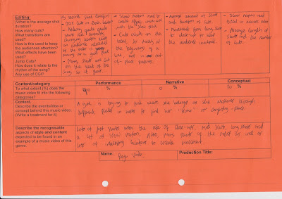
This is my textual analysis where I have analysed the music video 'Replaced' by Kate McGill as I think this is similar to the video that Raja and I would like to create. I have used this video for ideas such as the focusing in and out of things in the shots to point out to the audience important things or people in the video to help the audience understand it more. In Raja's and my video we will change locations and have a variety of lots of camera shots, angles and movements. The editing will be similar as we will change the length of the shots to the pace of the music like how the shots change to the pace in this video that I have analysed. 


Ideas Grid - Emma Cobb

I wrote this before but I am putting it on the blog now.


I looked at Taylor Swift as my original idea for my music video would have been from one of her songs. I had thought of this before I teamed up with Raja and decided to work on his idea with him. I listened to the song 'Today was a fairytale' and thought I could use some of the lyrics literally to create some shots and develop ideas, and also I thought the song overall conveyed a romantic date between the artist and her fairytale man. I decided that I could've put a twist in the video so that it was more interesting than just a date. I would have had the actress going on a date but it could be going all wrong and she is comparing everything to the fantasy in her head of a fairytale date, and then at the end she would realise that reality can still be a fairytale in a different way.

Wednesday, 17 October 2012

Shot List

Here is our shot list we have written for our music video. It has 80 different shots and we feel we have most certainly written it to the best standard to fit the music video. We split it into sections (verse, chorus, bridge) - of which fits our narrative and performance parts. We feel that the shot list will absolutely be an asset to filming our next scenes because we can have on set what our shot durations need to be and knowing what camera angles, shots and movements to use. This will also be extremely helpful in post-production when we want to edit, so we know exact durations of shots, which shots to use and where they will go.


Textual Analysis - Raja Virdi

Here is my textual analysis for two music videos - Gabrielle Aplin "Home" & Joy Mumford "For You My Friend". My research indicated the general conventions of the videos and how they can relate to the one we make. The conventions of both were very similar and we have used this information in our music video such as the range of camera shots, narratives and structure.